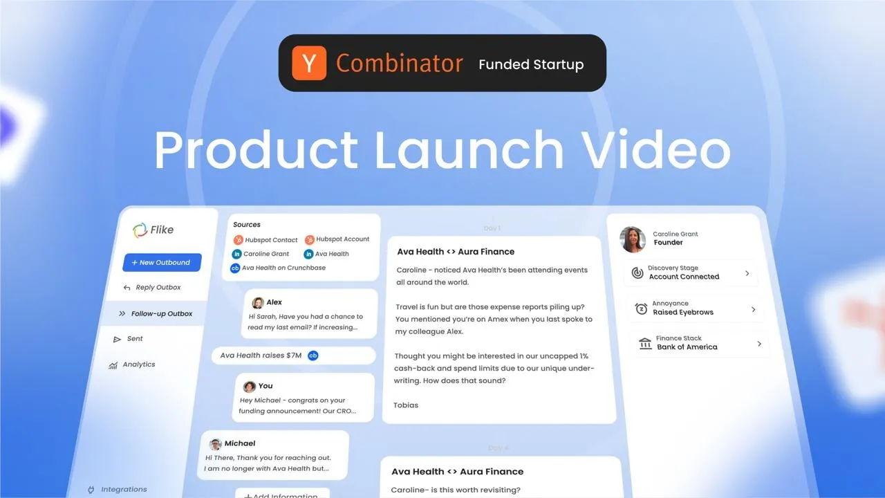
Flike AI is an AI sales copilot. It sits across Gmail, LinkedIn, Slack, HubSpot, Salesforce, Crunchbase, and X, watches for buying signals (a funding round, a new hire, a stalled deal), and drafts context-aware follow-ups automatically. The rep reviews, edits if needed, and sends.
That is a lot of product. Six-plus integrations, an AI drafting engine, an inbox layer, a queue, an analytics tab. The real creative problem was never “how do we show all of this.” It was “what is the one thing this product makes disappear.” This breakdown looks at how the video answers that in under 75 seconds, and why the four-beat structure it uses holds up as a repeatable model for any feature-heavy SaaS tool.
Section
Structure at a Glance
Every high-conversion explainer we build follows some version of this skeleton: Hook, Solution, Demo + Features, CTA. The Flike AI video is a clean, almost textbook example of it, so it is a useful one to break down beat by beat.
BEAT | WHAT HAPPENS | RUNTIME |
Hook | The scattered-tools problem, visualized around a person, not explained in a voiceover | 0:00 – 0:10 |
Solution | One line, one mark: everything routes into a single 360-degree view | 0:10 – 0:20 |
Demo + Features | Three proof points, each tied to a specific surface (inbox, LinkedIn, queue) | 0:20 – 1:04 |
CTA | The hook, mirrored: chaos becomes calm, then the ask | 1:04 – 1:14 |
Beat 1 — The Hook
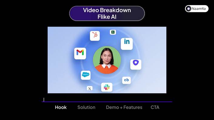
0:00 — One person, eight app icons orbiting her
No product name, no logo, no voiceover explaining a pain point. Just a person surrounded by Gmail, LinkedIn, Slack, HubSpot, Salesforce, Crunchbase, X, and one unlabeled icon, all pulsing at once.
This is the strategic choice worth naming: the hook sells the feeling of the problem, not the description of it. Anyone doing outbound recognizes that circle of icons instantly, sales tools scattered across a dozen tabs, because they live it every day. The video does not need to say “outbound is fragmented” when it can just show a person standing in the middle of the fragmentation. Recognition beats explanation in the first ten seconds, every time.
Beat 2 — The Solution
0:10 — The Flike mark resolves out of motion
The same swirl of color from the hook collapses into the Flike logo. It is a direct visual callback: the chaos of the opening scene literally becomes the brand mark. That is the entire solution pitch, delivered without a single word of copy.
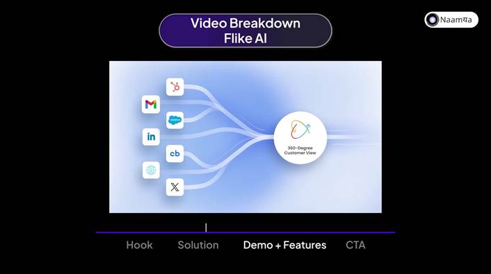
0:26 — Every source, one destination
Then the video earns the claim with one diagram: every source (HubSpot, Gmail, LinkedIn, Crunchbase, X) flows into a single node labeled “360-Degree Customer View.” One promise, one visual, no feature list yet. The feature list comes next, but only after the viewer knows what all of it is in service of.
Beat 3 — Demo + Features
At over 40 seconds, this is the longest section by far, and it is doing the most disciplined work in the video. Instead of a feature tour, it is structured as three separate proof points, each one answering a different version of “wait, does it actually work like that?”
Proof point 1: It finds the opportunity for you
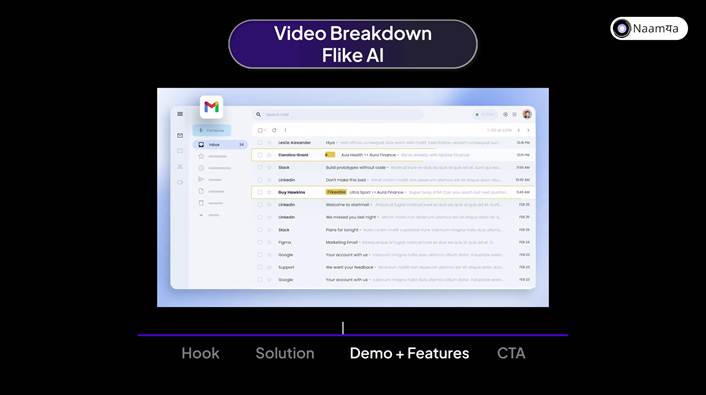
A live Gmail inbox with one email tagged “Flikeable”
Rather than describe signal detection, the video drops a real Gmail inbox on screen and highlights a single email with a yellow “Flikeable” tag, a prospect mentioning they are too busy to talk this quarter. It is a small detail, but it is the one that matters most for trust: the AI is not generating outreach from nothing, it is watching real inboxes and flagging the moment worth acting on.
Proof point 2: It writes the message, you approve it
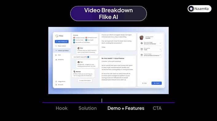
Inside the Flike dashboard, an AI-drafted follow-up with sourced context
Cut to the Flike dashboard itself. The draft on screen references a specific, sourced detail, a competitor's funding round, and offers a concrete counter-pitch. Two buttons sit under it: Skip and Send. This is the detail that separates a believable AI feature from a hand-wavy one: the human stays in control of the send, the AI just removes the blank-page problem.
Proof point 3: It is not just email
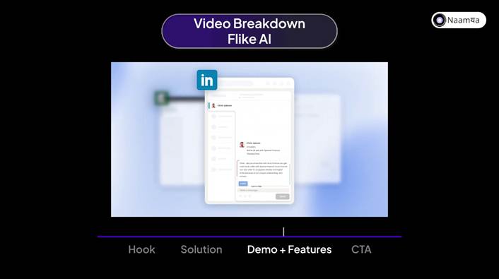
The same drafting experience inside a LinkedIn DM
The video repeats the exact same interaction, insert, edit, send, inside a LinkedIn conversation. This is a cheap but effective way to prove platform coverage without a second explanation: show the identical UI pattern on a second surface, and the viewer's brain fills in “so it works everywhere.”
Proof point 4: It scales
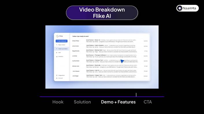
A queue of eight personalized follow-ups, ready to send
The section closes by pulling back from the single-email view to a full “Follow-Ups ready to send” queue, eight different prospects, each with a distinct, specific opening line. This is the payoff shot: everything demonstrated at the individual level a moment ago is shown working at volume. It is also where the video briefly breaks tone with a reaction cutaway (a startled face over a giant “WOW”), a small, human beat before returning to product.
Beat 4 — The CTA
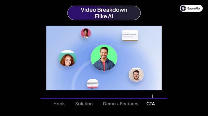
1:04 — Smiling faces replace the scattered icons
The closing scene mirrors the opening one almost shot for shot: the same circular composition of faces that opened the video, but now smiling, with personalized message previews popping in around them instead of app icons. Chaos has become calm.
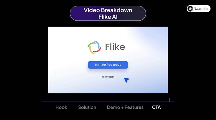
1:10 — The ask, only after the emotional resolution
Only after that resolution does the logo, the button, and the URL appear. The CTA itself is a single line, “Try it for free today,” with no pricing, no form, no friction. By this point in the video the ask does not need to work hard, the visual argument already closed the loop.
Why the Structure Works
● Show the feeling before the feature. The hook never states the problem in words, it stages it. That is what makes the first ten seconds land with a viewer who has never heard of Flike AI.
● One solution line before any feature list. The 360-Degree View diagram gives the viewer a single mental model to hang every feature on, so the demo section never feels like a list.
● Prove, do not describe. Every claim in the Demo + Features section is shown inside a real product surface, an inbox, a dashboard, a DM window, never summarized in a lower-third.
● Repeat the pattern to prove range. Showing the identical insert-and-send interaction on Gmail and then LinkedIn is a cheaper, faster way to prove multi-platform coverage than a features slide would be.
● Close the loop visually before you close it verbally. Mirroring the hook's composition in the CTA lets the viewer feel the transformation a beat before the button ever appears.
The Naamya Read
This is the same Hook, Solution, Demo + Features, CTA skeleton we build every explainer around, and it holds up here because the team resisted the urge to cover every integration. Six-plus tools, one video, one sentence of positioning: everything routes into a single view. Everything else in the video exists to prove that sentence, not to introduce new ones.
That is the test we run on our own scripts before a single frame gets animated: if the demo section could not survive losing any one shot without losing a distinct proof point, it is padding. Flike AI's breakdown does not have that problem, and it is 74 seconds because of it, not in spite of it.